Picking the right colors can totally change a space and even affect how you feel. After spending so many hours playing around with different colors, I can honestly say that getting the palette right makes a huge difference.
In this post, I’m going to share some tips from my own experience to help you find the perfect color scheme for your space.
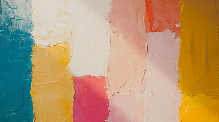
The Basics of Color Theory

The color wheel, invented by Sir Isaac Newton, is a fundamental tool. It consists of:
- Primary colors: Red, blue, and yellow
- Secondary colors: Green, orange, and purple (created by mixing primary colors)
- Tertiary colors: Colors made by mixing primary and secondary colors
Color Relationships
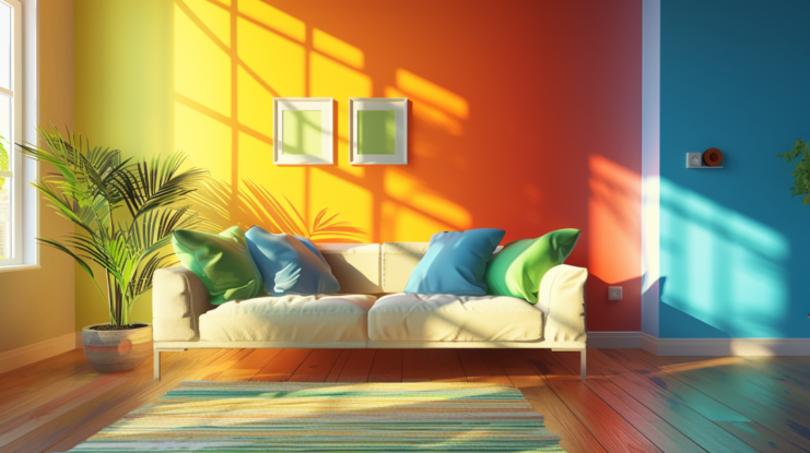
- Complementary colors: Colors opposite each other on the wheel (e.g., red and green) that create high contrast and vibrant looks.
- Analogous colors: Colors next to each other on the wheel (e.g., blue, blue-green, and green) that blend well and are pleasing to the eye.
- Triadic colors: Three colors evenly spaced around the wheel (e.g., red, yellow, and blue) that offer balance and contrast.
- Monochromatic colors: Variations of a single color using different shades, tones, and tints, providing a cohesive and soothing palette.
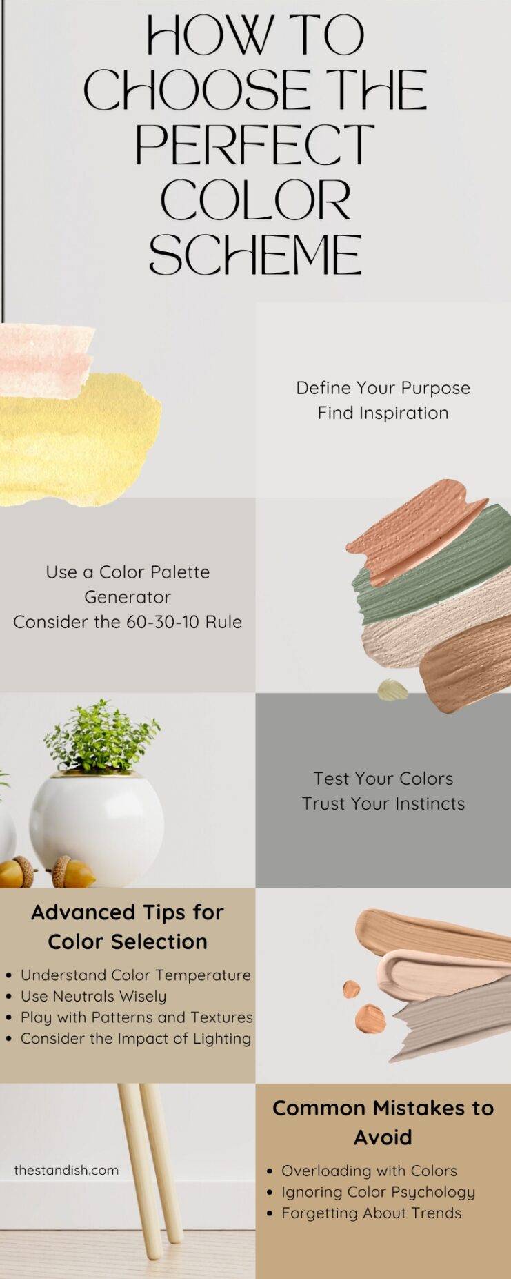
Step-by-Step Guide to Choosing a Color Scheme

1. Define Your Purpose
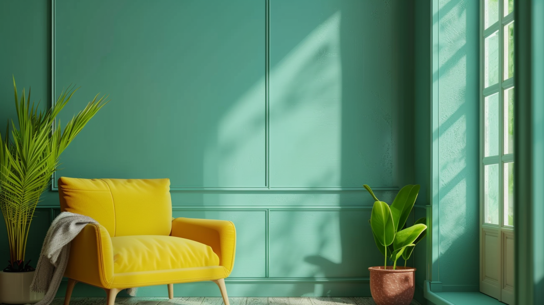
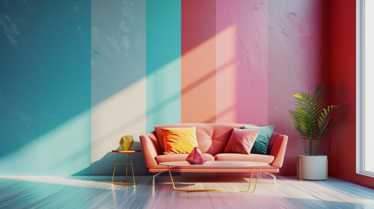
Ask yourself what the primary goal of your project is. Are you trying to create a relaxing bedroom or a lively living room? The purpose will guide your color choices. For example, calming colors like blues and greens are perfect for a bedroom, while vibrant colors like reds and yellows can energize a living room.
2. Find Inspiration
Look for inspiration in your surroundings, nature, art, or even your wardrobe. When I redecorated my living room, I took inspiration from a painting I loved.
The colors in the artwork became the basis for my palette, creating a cohesive and personalized space. As I constructed my gallery wall, I incorporated pieces that echoed the theme of the painting, tying the room’s design together effortlessly.
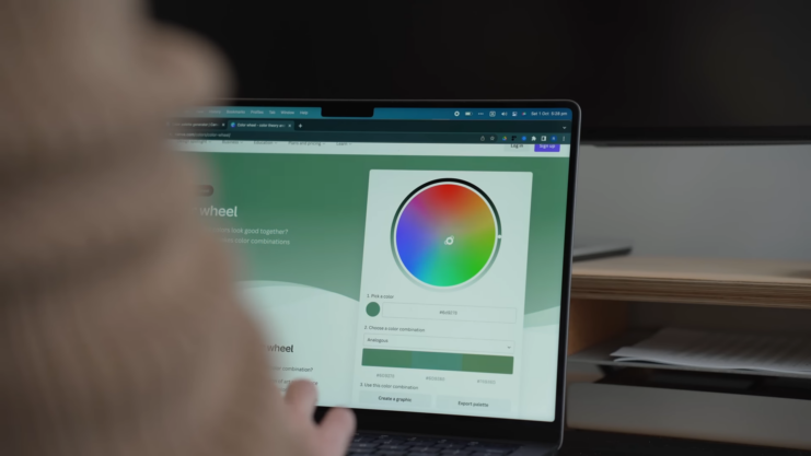
3. Use a Color Palette Generator
Online tools like Adobe Color or Coolors can help you generate color palettes based on your preferences. These tools allow you to experiment with different combinations and see how they look together before making a final decision.
4. Consider the 60-30-10 Rule
This classic design rule helps create a balanced and visually appealing color scheme:
- 60{92a8552a75dd3ce08e9d5a581c3ae33f18c249814701aa9b58409953b2bc4c65}: Dominant color (e.g., walls)
- 30{92a8552a75dd3ce08e9d5a581c3ae33f18c249814701aa9b58409953b2bc4c65}: Secondary color (e.g., furniture)
- 10{92a8552a75dd3ce08e9d5a581c3ae33f18c249814701aa9b58409953b2bc4c65}: Accent color (e.g., accessories)
Using this rule, you can ensure that your space doesn’t feel overwhelming or underwhelming.
5. Test Your Colors
Before committing to a color scheme, test your colors. Paint swatches on your walls or create digital mockups for your website.
Observe how the colors look in different lighting conditions. What looks great in natural light might not look the same under artificial lighting.
6. Trust Your Instincts
While guidelines and tools are helpful, trust your instincts. If a color combination feels right to you, go for it. Personal preference plays a significant role in creating a space or design that you’ll love.
4 Advanced Tips for Color Selection
1. Understand Color Temperature
Colors are classified as warm (reds, oranges, yellows) or cool (blues, greens, purples). Warm colors can make a space feel cozy and inviting, while cool colors create a calm and refreshing atmosphere. Mixing warm and cool colors can add depth and interest to your design.
2. Use Neutrals Wisely
Neutrals like whites, grays, and beiges are essential in any color scheme. They balance out bold colors and provide a backdrop that makes other colors pop. Incorporate neutrals to create contrast and prevent your design from feeling too busy.
3. Play with Patterns and Textures
Adding patterns and textures can enhance your color scheme. A patterned rug, textured wallpaper, or a mix of fabrics can bring your colors to life and add dimension to your design.
4. Consider the Impact of Lighting
Lighting affects how colors appear. Natural light shows the true color, while artificial light can change the hue and intensity. Use lighting to highlight certain areas and create the desired ambiance.
3 Common Mistakes to Avoid
1. Overloading with Colors
Using too many colors can overwhelm the viewer. Stick to a limited palette and use different shades and tints of the same color to add variety without clutter.
2. Ignoring Color Psychology
Colors evoke emotions and associations. Ignoring this can lead to unintended effects.
3. Forgetting About Trends
While it’s essential to choose colors you love, being aware of current trends can keep your design fresh and relevant. However, don’t rely solely on trends; blend them with timeless choices to ensure longevity.
In Summary
Picking the right colors can be a game-changer for your space or project. It might seem tricky at first, but once you get the hang of some basics—like color theory and what vibe you’re going for—it gets a lot easier. Use some handy tools and tips to help you out.
But honestly, the key thing is to choose colors you love. They should make you feel good, whether that’s happy, cozy, or inspired.